Product Label Design

Papa's Dhaba Label Packaging Design
Papa's Dhaba

Product Label Design

A product label design for Papa’s Dhaba to extend their range.
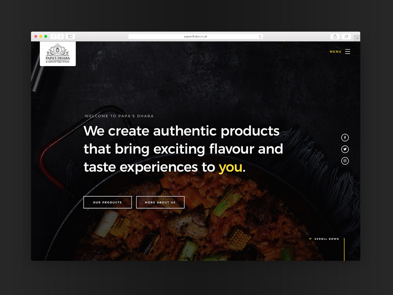
Papa's Dhaba

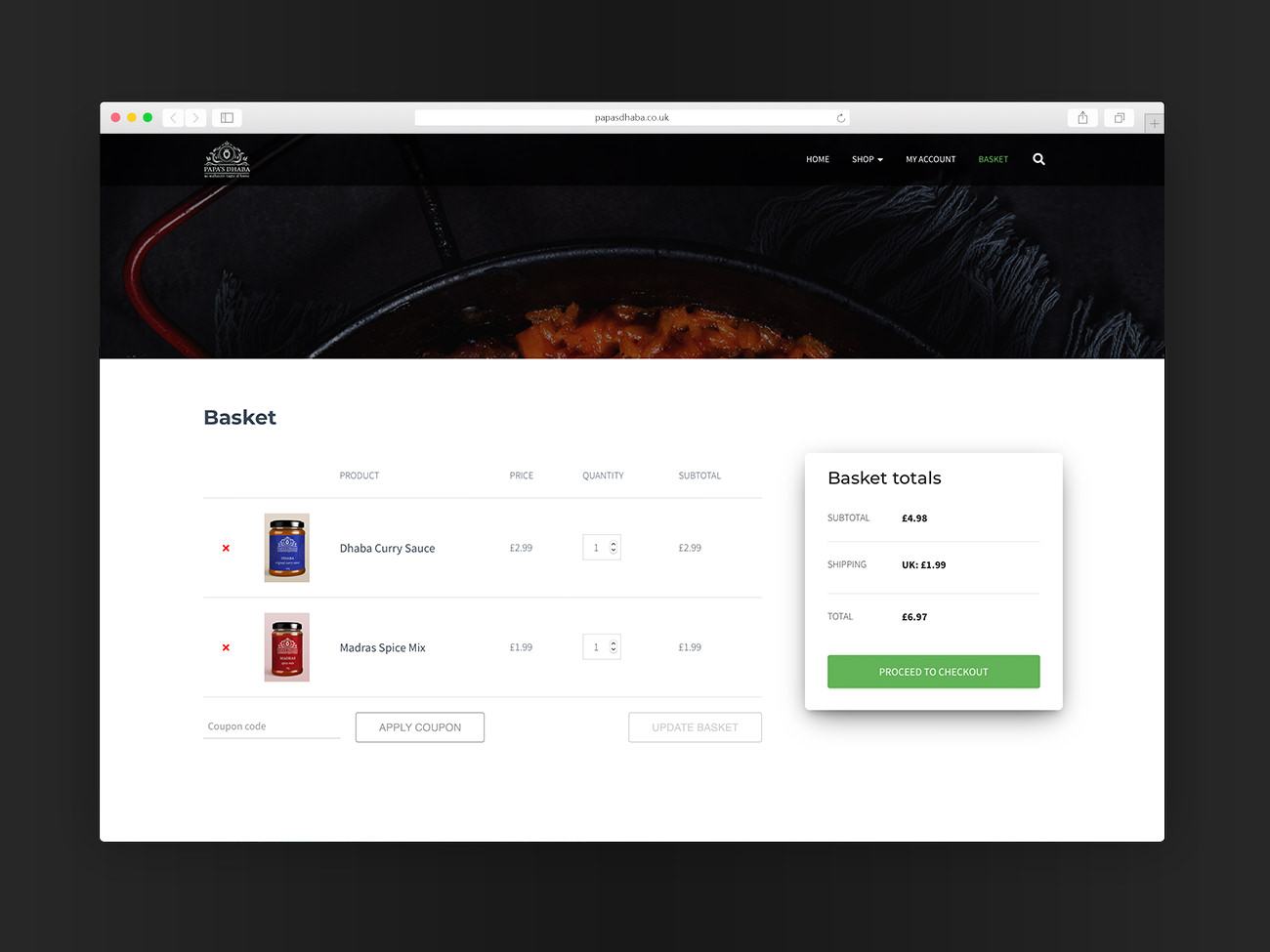
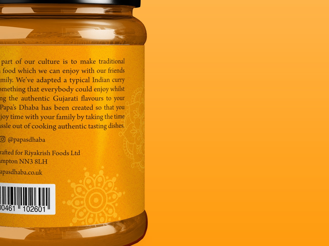
Papa’s Dhaba brings authentic Indian tastes and flavours into the home with their range of curry sauces, spice mixes, chutneys and pickles. Based in Northampton but serving the whole UK with a focus on making delicious, unique and memorable experiences to the home kitchen.

The Project

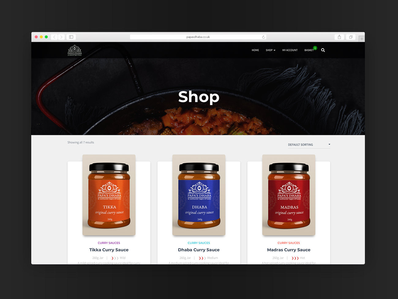
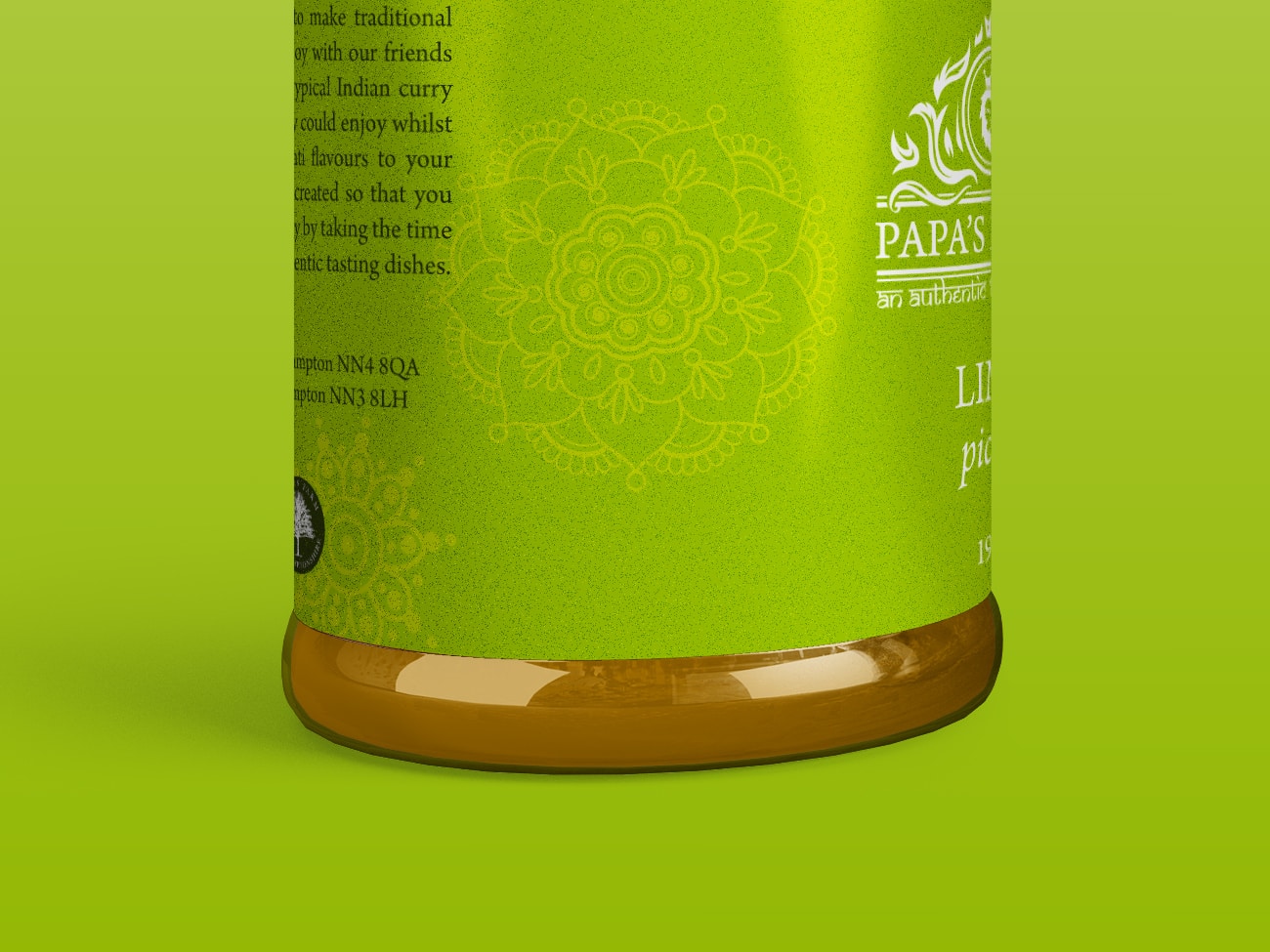
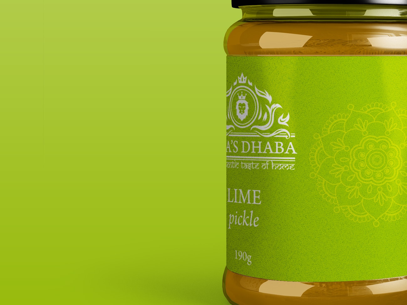
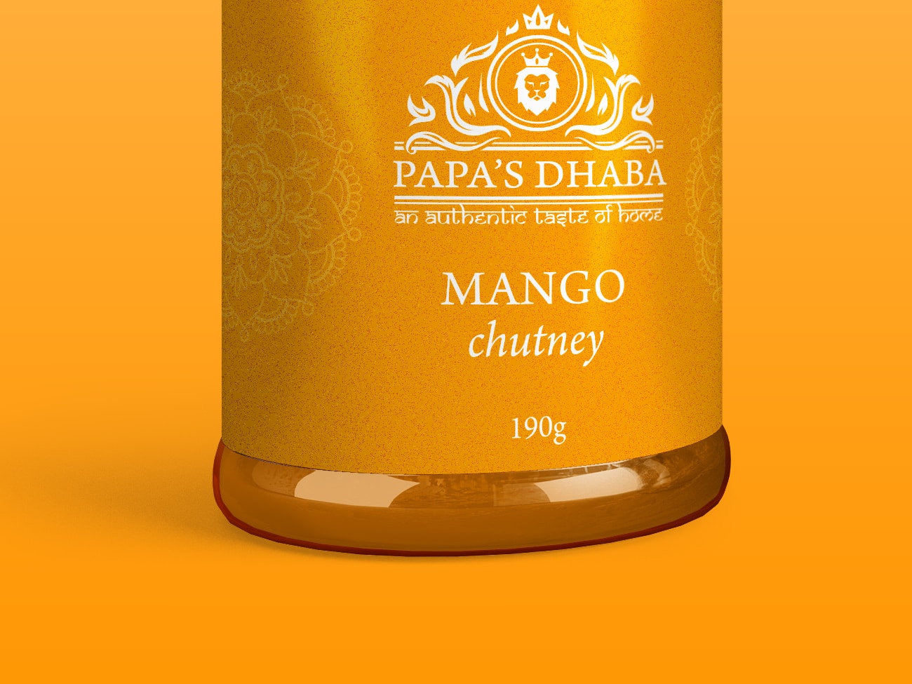
Our challenge was to extend their existing range of curry sauces by developing product packaging for their new lime pickle and mango chutney.

The designs would follow the existing vibrant authentic branding seamlessly, keeping that instant recognisablity. At the same time, they would need to invoke the flavours and tastes of the condiment contained within.

Project Overview

client: Papa's Dhaba

services: Graphic Design

Date: June 2020

Colours you can taste

One crucial part of the project was getting the perfect colour to deliver the tangy flavours to the customer before they’ve even bought it.

What Papa's Dhaba Say

  A valuable kick-start for the new business...

Acethespace delivered a truly outstanding website for our new start-up business. Its given us the perfect start with a high-quality feel from the get-go which is crucial. During the development, Dom who looked after the project was second-to-none, highly motivated, attentive and nothing was too big of an ask. I highly recommend.

Kunal Patel
Papa’s Dhaba

Shall we get started?

Paper Cup Design

Café Allez! Paper Cup Design
Café Allez!

Paper Cup Design

A disposable paper cup design for Café Allez! to extend their brand.

work Outline

Having worked with Café Allez! on numerous project before, they approached us with a new concept for developing their branding even further.

With their business flourishing, Café Allez! looked to have branded paper cups designed to put their branding into their customers’ hand.

The Process

After much discussion, and a variation of different designs, an uncomplicated concept was decided upon, using just a small palette of blues to suit both sides of the business.

Two final design variants were produced for two sizes of cup, both with the same brand message and style.

Project Overview

client: Café Allez!

services: Graphic Design

Website: cafeallez.uk

Date: March 2020

Seemless design

With Café Allez! having two sides to their business with a slight variation in the branding for them it was essential that the design work for both sides for full versatility and effectiveness.

What Café Allez! Say

  They have the rare ability to listen

We would recommend Acethespace Design without a single hesitation. Their service is fantastic. They have the rare ability to listen to and fully understand your needs, but also the creativity to take your own concepts to the next level. The speed and quality of their service is exceptional. Acethespace designed and built our website, which is superb, but we would also recommend them for other ad hoc graphic design work.

Mark and Claire
Café Allez!

Shall we get started?

Festival Branding

Harborough BeachFest – Brand Logo Design

Festival Branding

A fun, vibrant brand design for summer festival start-up Harborough BeachFest.

work Outline

HBf approached us with their beach festival concept hoping to kick-start a new buzz in the local area of Harborough. The project needed to simulate exactly what the festival is all about and portray a fun message.

The Process

Everything from the colour palette, to the typefaces used, fun was the key. The colours brought together a summer feel with the bold but softened lettering making for a friendly identity.

Project Overview

client: Harborough BeachFest

services: Brand & Logo Design

Date: June 2020

Sun, Sea & Sand

The colour palette used emulates exactly what the festival is all about.

What Harborough BeachFest Say

 absolutely thrilled...

We chose Acethespace Design after hearing so many rave reviews about work they’ve done for many of the businesses in the local area – and we were not disappointed. They hit the nail square on the head with every ask, we are absolutely thrilled with what they have done for us and highly recommend their services.

Harborough BeachFest

Shall we get started?

Festival Website

Fleckney Festival – Website Web Design
Fleckney Festival

Promotional Website

A website designed and developed for the annual Fleckney Festival, built on pure coded HTML, CSS, and JS – hosted and maintained to maximise overall versatility and functionality.

work Outline

A simple website construction for the annual Fleckney Festival. The website is specified to be simple and stripped down with just the bare information to keep costs within budget but clarity high.

The Process

The website itself undergoes a new theme each year to match the festival with just the website’s core skeleton staying the same.

Project Overview

client: Fleckney Festival

services: Web Design & Hosting

Date: August 2020

Clear and simple

As a purely informative site with content that has a life span on only a few months, the actual concept had to be very simple and clear.

What Fleckney Festival Say

  An extremely high standard...

Fleckney Festival has been using Acethespace Design for a number of years and have always found their work of an extremely high standard. Our latest website update for this year’s event involved selling tickets, and the whole booking process is very simple and straightforward for the public to use which makes our life a lot easier. I would highly recommend Acethespace Design

Michael Preston
Chairman & Head Organiser

Shall we get started?

Company Website

Ausden Clark Group – Website Design
Ausden Clark Group

Company Website

A website designed and developed for Ausden Clark Group, using an array of softwares including pure HTML, CSS, PHP, and JS – hosted and maintained to maximise overall versatility and functionality.

work Outline

Ausden Clark Group came to us in need of a total rebrand to freshen the business and portray a much more friendly and inviting image.

A major part of the rebrand was their website – it would require a total rebuild to bring it up to modern standards and compliance. This would aid both the visual appeal to customers, but also online presence through smart SEO throughout the site.

Along with the build, hosting and maintenance of the site was another need that would need to be provided for. 

The Process

After establishing the rebrand in terms of a new logo, colour palette, print media, social image and such – we moved onto developing an all-new website to continue to carry the new branding.

It was key that the design would continue the light, uplifting style with plenty of spacing, easy to follow blocks and an overall clean layout to ensure navigation was intuitive and information was interpreted with ease.

Once we had reached the final product a maintenance agreement was reach that meant Ausden Clark would not need to worry about updating the site and content themselves, as any changes would be taken care of along with hosting of the entire setup.

Project Overview

client: Ausden Clark Group

services: Web Design & Hosting

Date: May 2020

Branding, branding, branding

As one of Leicester most recognisable brands with their exuberantly vivd magenta pink livery, we ensured the website stuck by AC’s prominent branding.

What Ausden Clark Say

  The highest level of quality...

Acethespace Design have completely exceeded all expectations on this project. They’ve delivered us with not only a beautiful creation that covers ever ask but also outstanding results with initial analytics showing more than a 300% increase in customer visits.

Adam Frost
General Manager

Shall we get started?

eCommerce Website

Papa's Dhaba
Papa's Dhaba

eCommerce Website

The website design and developed for new start-up, Papa’s Dhaba, including an eCommerce system for the sale of their line of products.

work Outline

Papa’s Dhaba approached us for the design of their website and online presence as a new company, keen to emulate the success they had heard about from other clients in a similar industry.

The project needed to include an ecommerce platform for selling their product line, with an accessible back-end for self-managing of orders.

The Process

After discussions to outline a clear vision for the overall online presence, we set to work on building Papa’s online brand and store.

Project Overview

client: Papa's Dhaba

services: Web Design

Date: April 2020

Hints of colour

Being of Indian origin, Papa’s were clear on the use of vibrant colours to authentically fit the brand ethos and heritage.

What MMWL Say

  A valuable kick-start for the new business...

Acethespace delivered a truly outstanding website for our new start-up business. Its given us the perfect start with a high-quality feel from the get-go which is crucial. During the development, Dom who looked after the project was second-to-none, highly motivated, attentive and nothing was too big of an ask. I highly recommend.

Kunal Patel
Papa’s Dhaba

Shall we get started?

Company Branding

SpartanWare Apparel
SpartanWare Apparel

Company Branding

A modern brand design with hints of national pride for custom clothing provider SpartanWare Apparel.

work Outline

Being a new startup, SpartanWare Apparel were in need of a slick branding for their custom clothing business.

The business itself was started and is run by British military veterans, and this required a nod in the branding.

SpartanWare wanted to have a versatile logo design to use in a multitude of circumstances in the form of a text logo, a logo icon, and a shorthand logo.

The Process

After numerous designs, the final design settled for is composed of tones of red, white and blue to represent the British roots of the business, in particular its military heritage.

Project Overview

client: SpartanWare Apparel

services: Brand Design

Date: June 2019

Modern & Unique

It was crucial that the branding would stand apart from anything else, but be modern and slick at the same time.

What SpartanWare Say

  ...totally unique and refreshing...

We are absolutely thrilled with the branding produced. It has encapsulated everything we wanted and gives us a totally unique and refreshing identity to set us apart from our competitors.

Amy Darbyshire
SpartanWare Apparel

Shall we get started?

Company Website

Café Allez! Website
Café Allez!

Company Website

A website designed and developed for Café Allez! built on a pure HTML5 framework twined with CSS3 and JS – managed and maintained by us to maximise overall versatility and functionality with expert precision.

work Outline

New start-ups, Café Allez!, were in need of a website after already having established a logo design but not yet a full brand. The website needed to encapsulate exactly what their new venture would cover along with showcasing it to get the business off the ground.

The Process

Being based just across the county in the heart of the Belvoir Vale, meant setting up a meeting was a breeze, this gave us copious opportunities for establish exactly what the site would need to cover.
Once done, we went through the phases of research, wireframe drafting, and finally building with the usual tweaks and amends before launch.

Project Overview

client: Café Allez!

services: Web Design

Website: cafeallez.uk

Date: July 2017

Timeless design

Creating a design that stands the test of time can be crucial, especially for start-ups. The website was completed in 2017, yet still feel as modern as ever with only the most minimal changes since launching the site.

What Café Allez! Say

  They have the rare ability to listen

We would recommend Acethespace Design without a single hesitation. Their service is fantastic. They have the rare ability to listen to and fully understand your needs, but also the creativity to take your own concepts to the next level. The speed and quality of their service is exceptional. Acethespace designed and built our website, which is superb, but we would also recommend them for other ad hoc graphic design work.

Mark and Claire
Café Allez!

Shall we get started?

Day Trips Brochure

Fleckney Group Brochure Design
Fleckney Group

Brochure Design

The 2019-20 edition brochure for local coach day trip provider Fleckney Group.

work Outline

Fresh off the back of a rebrand, the newly named Fleckney Group (formerly APCR) were all set for having their 2019-20 brochure design. A comprehensive brochure to showcase their roster of trips for the coming year along with company information and details.

The Process

Having worked with the client for many years already we knew exactly what they were after and got straight to it, designing a brochure to match their newly formed branding.

Project Overview

client: Fleckney Group

services: Graphic Design

Date: 17 July 2019

Silky calmness

We focused our efforts on carrying the silky calm feeling of the brand into the design, with smooth curves and soft gradients we kept the design on brand, with a clean and effortless tone.

What Fleckney Group Say

  Again, the best yet, the customers love it.

Everytime Acethespace nail exactly what we are going for and carry the branding perfectly. So many customers have received the new brochure and commented on how much they love it. Just perfect.

Michael Preston
Managing Director

Shall we get started?

Company Website

Anstey & District Funeral Services Web Design
Anstey & District Funeral Services

Company Website

A website designed and developed for Anstey & District Funeral Services, built using pure HTML, CSS and JS – hosted and maintained in-house to maximise overall versatility and functionality.

work Outline

Anstey & District came to us in need of a total rebrand to freshen the business and portray a much more friendly and inviting image.

A major part of the rebrand was their website – it would require a total rebuild to bring it up to modern standards and compliance. This would aid both the visual appeal to customers, but also online presence through smart SEO throughout the site.

Along with the build, hosting and maintenance of the site was another need that would need to be provided for. 

The Process

After establishing the rebrand in terms of a new logo, colour palette, print media, social image and such – we moved onto developing an all-new website to continue to carry the new branding.

It was key that the design would continue the light, uplifting style with plenty of spacing, easy to follow blocks and an overall clean layout to ensure navigation was intuitive and information was interpreted with ease.

Once we had reached the final product a maintenance agreement was reach that meant Anstey & District would not need to worry about updating the site and content themselves, as any changes would be taken care of along with hosting of the entire setup.

Project Overview

client: Anstey & District Funeral Services

services: Web Design & Hosting

Date: May 2018

Friendly and inviting

For this project, it was crucial that the design stayed true to the new branding and upheld a friendly and inviting feel to lift their online presence.

What Anstey & District Say

  ---

Arran Brudenell
Managing Director

Shall we get started?