Day Trip Branding
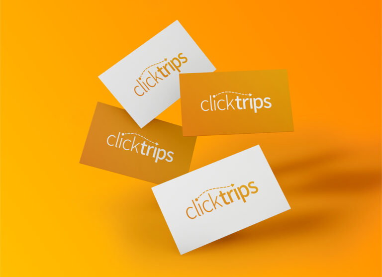
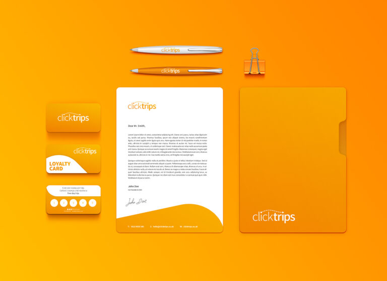
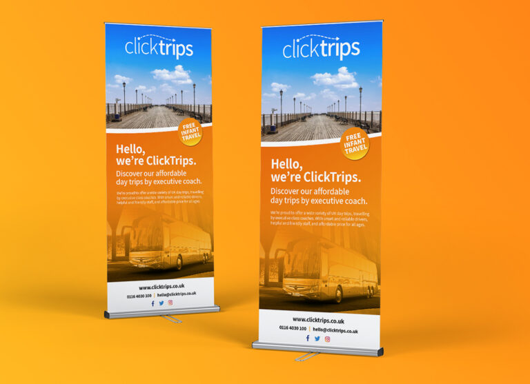
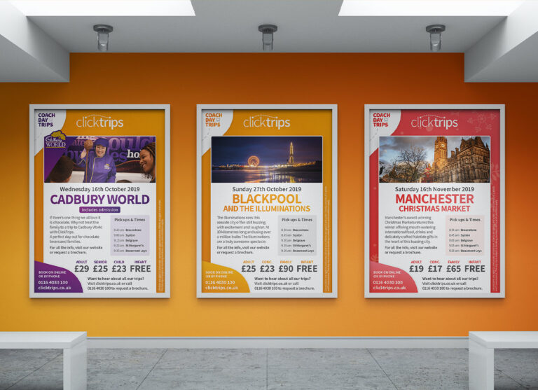
A warm and inviting brand design for startup coach day trip business, ClickTrips.
work Outline
As a new startup, ClickTrips were looking to establish a branding. The business itself would be very customer-centric, focussing on delivering a reliable, friendly and personal service to its customers.
It was key that the overall design was warm and inviting, whilst portraying the transport and travel element of the business venture.
The Process
After meeting to discuss the project further to identify keys areas we wanted the branding to focus itself around, we kicked things off with draft designs for the brand logo.
Firstly designing various concepts without colour, these concepts were presented and whittled down to just a few for further development.
Once we had reached the final logo design the brand colour scheme and styling followed, again offering a plethora of option, the warm glow of a sunset gradient stood out.
Designed to invite
The overall branding has been specifically tailored to give a warm and inviting feel with its use of gradient colours twinned with a clean white and smooth curving edges.
What ClickTrips Say
Everyone loves the warm glow of colours.
The brand design is an absolute triumph. We’re constantly being told how much people love our colours, our logo, and the design of all of our branded material. It is more than just a step ahead of our competitors.
The ClickTrips Team


