Product Label Design

Papa's Dhaba Label Packaging Design
Papa's Dhaba

Product Label Design

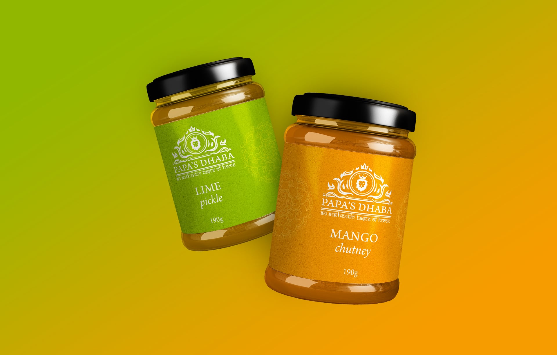
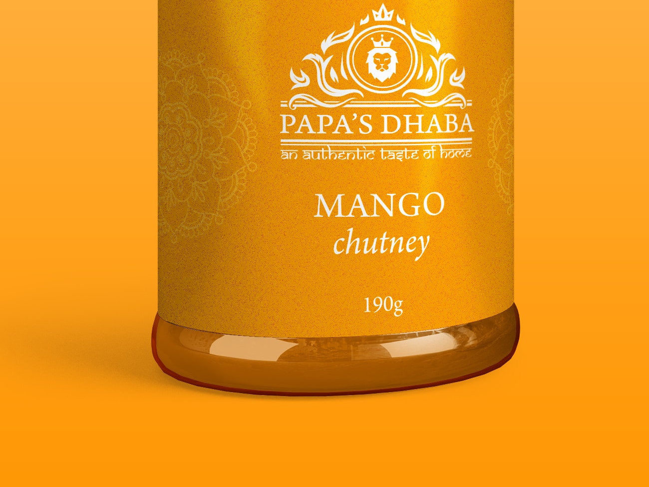
A product label design for Papa’s Dhaba to extend their range.

Papa's Dhaba

Papa’s Dhaba brings authentic Indian tastes and flavours into the home with their range of curry sauces, spice mixes, chutneys and pickles. Based in Northampton but serving the whole UK with a focus on making delicious, unique and memorable experiences to the home kitchen.

The Project

Our challenge was to extend their existing range of curry sauces by developing product packaging for their new lime pickle and mango chutney.

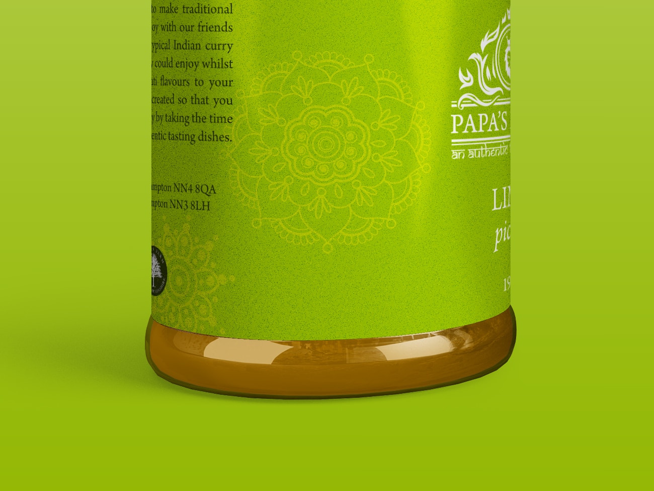
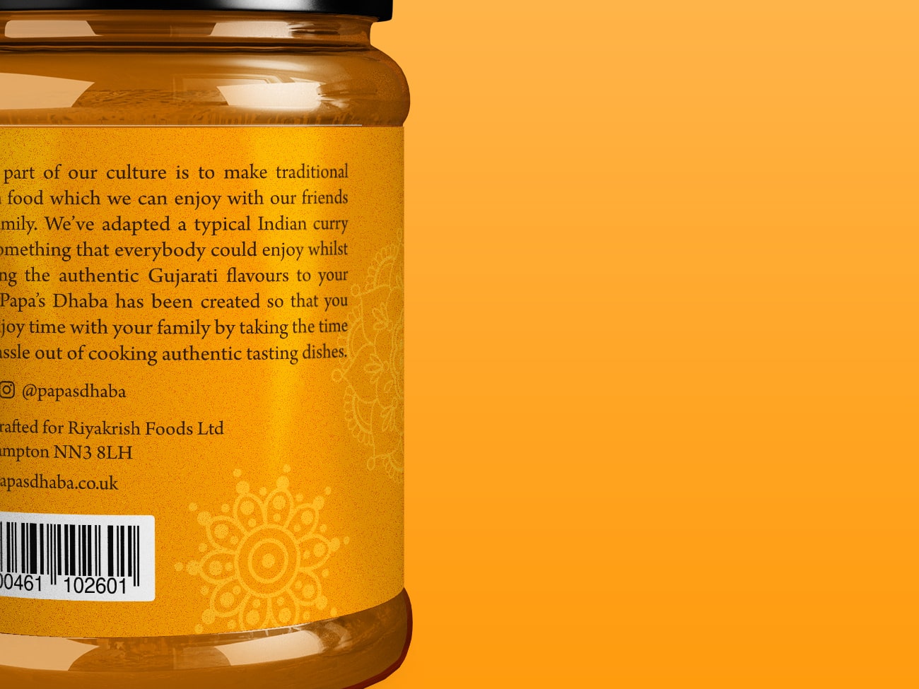
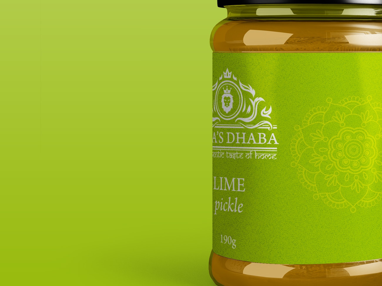
The designs would follow the existing vibrant authentic branding seamlessly, keeping that instant recognisablity. At the same time, they would need to invoke the flavours and tastes of the condiment contained within.

Project Overview

client: Papa's Dhaba

services: Graphic Design

Date: June 2020

Colours you can taste

One crucial part of the project was getting the perfect colour to deliver the tangy flavours to the customer before they’ve even bought it.

What Papa's Dhaba Say

  A valuable kick-start for the new business...

Acethespace delivered a truly outstanding website for our new start-up business. Its given us the perfect start with a high-quality feel from the get-go which is crucial. During the development, Dom who looked after the project was second-to-none, highly motivated, attentive and nothing was too big of an ask. I highly recommend.

Kunal Patel
Papa’s Dhaba

Shall we get started?

Paper Cup Design

Café Allez! Paper Cup Design
Café Allez!

Paper Cup Design

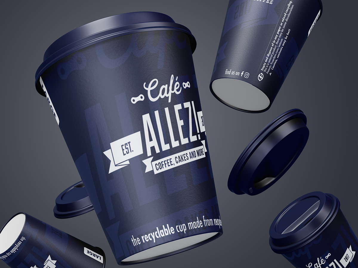
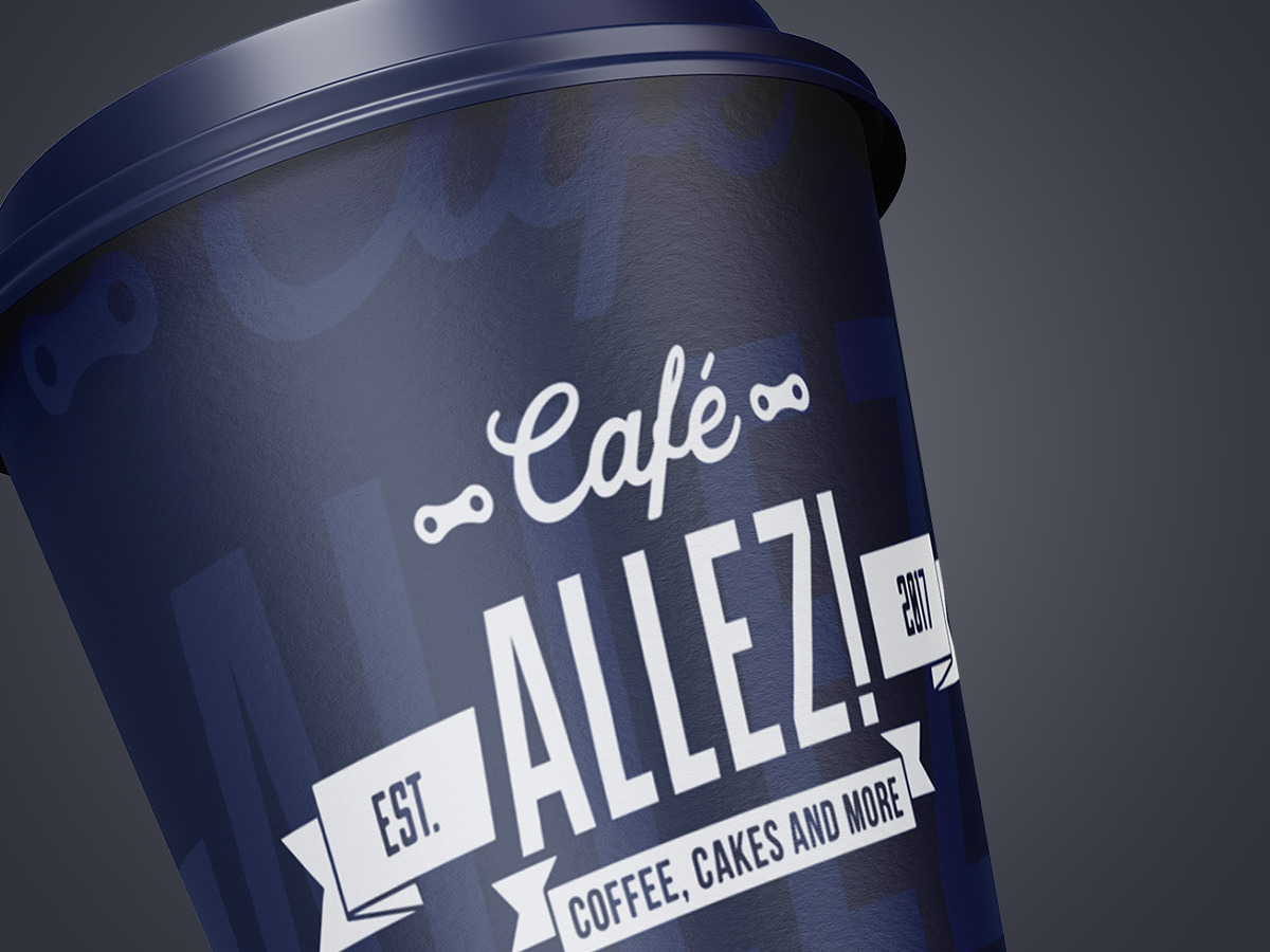
A disposable paper cup design for Café Allez! to extend their brand.

work Outline

Having worked with Café Allez! on numerous project before, they approached us with a new concept for developing their branding even further.
With their business flourishing, Café Allez! looked to have branded paper cups designed to put their branding into their customers’ hand.

The Process

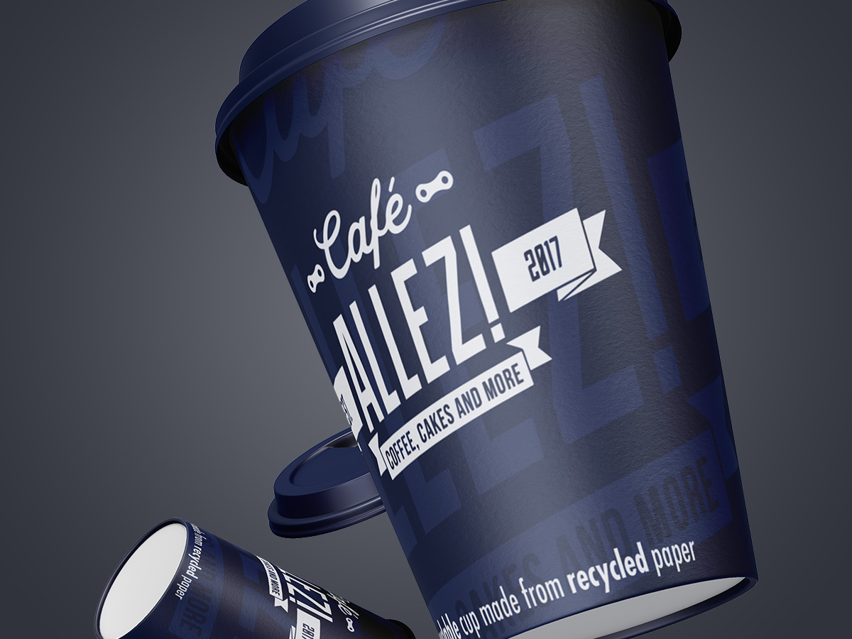
After much discussion, and a variation of different designs, an uncomplicated concept was decided upon, using just a small palette of blues to suit both sides of the business.

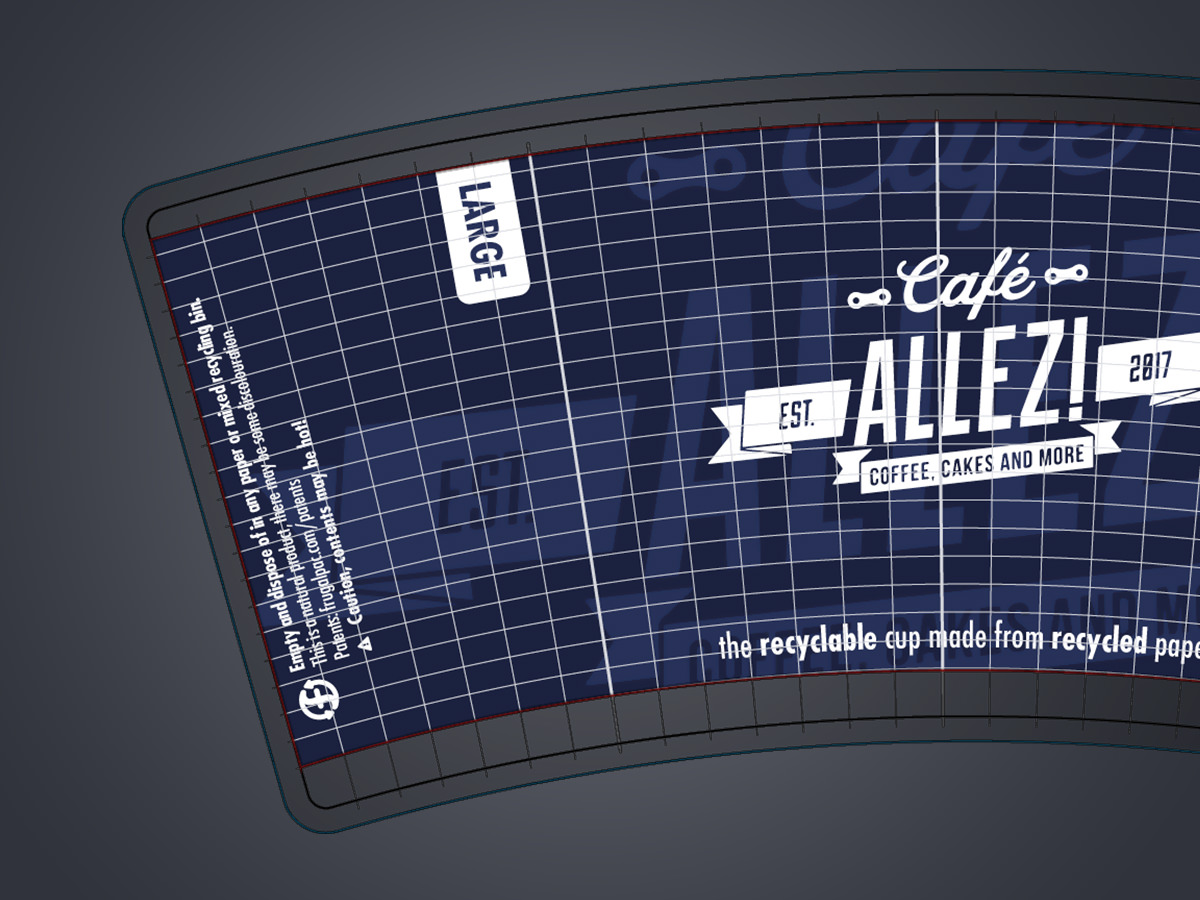
Two final design variants were produced for two sizes of cup, both with the same brand message and style.

Project Overview

client: Café Allez!

services: Graphic Design

Website: cafeallez.uk

Date: March 2020

Seemless design

With Café Allez! having two sides to their business with a slight variation in the branding for them it was essential that the design work for both sides for full versatility and effectiveness.

What Café Allez! Say

  They have the rare ability to listen

We would recommend Acethespace Design without a single hesitation. Their service is fantastic. They have the rare ability to listen to and fully understand your needs, but also the creativity to take your own concepts to the next level. The speed and quality of their service is exceptional. Acethespace designed and built our website, which is superb, but we would also recommend them for other ad hoc graphic design work.

Mark and Claire
Café Allez!

Shall we get started?

Festival Branding

Harborough BeachFest – Brand Logo Design

Festival Branding

A fun, vibrant brand design for summer festival start-up Harborough BeachFest.

work Outline

HBf approached us with their beach festival concept hoping to kick-start a new buzz in the local area of Harborough. The project needed to simulate exactly what the festival is all about and portray a fun message.

The Process

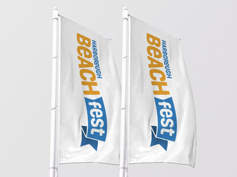
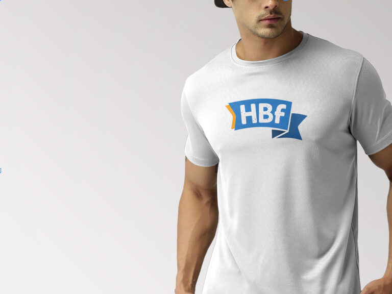
Everything from the colour palette, to the typefaces used, fun was the key. The colours brought together a summer feel with the bold but softened lettering making for a friendly identity.

Project Overview

client: Harborough BeachFest

services: Brand & Logo Design

Date: June 2020

Sun, Sea & Sand

The colour palette used emulates exactly what the festival is all about.

What Harborough BeachFest Say

 absolutely thrilled...

We chose Acethespace Design after hearing so many rave reviews about work they’ve done for many of the businesses in the local area – and we were not disappointed. They hit the nail square on the head with every ask, we are absolutely thrilled with what they have done for us and highly recommend their services.

Harborough BeachFest

Shall we get started?

Company Branding

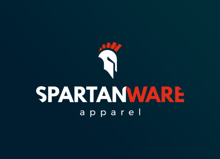
SpartanWare Apparel
SpartanWare Apparel

Company Branding

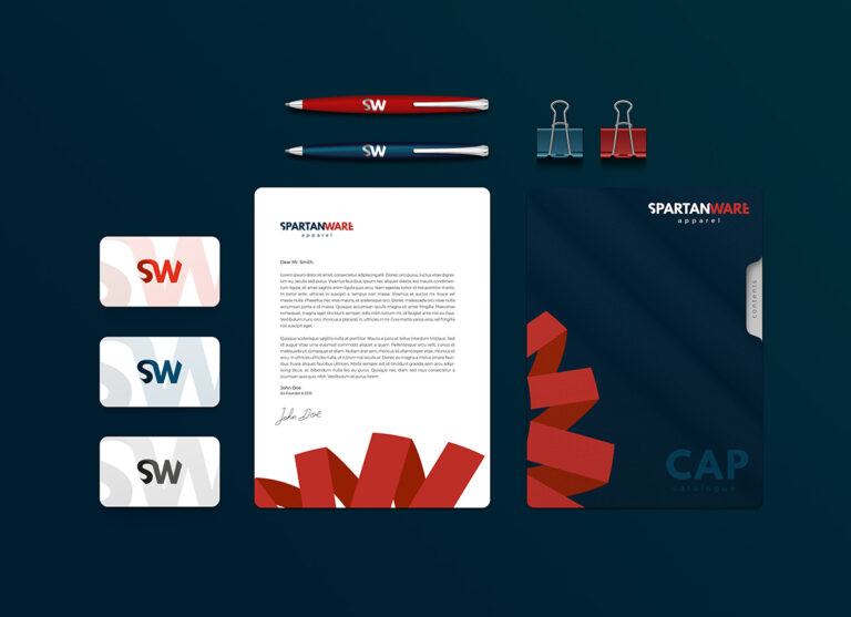
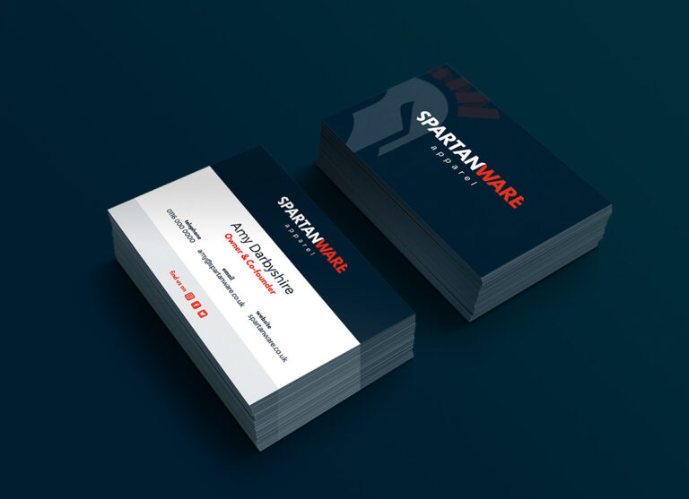
A modern brand design with hints of national pride for custom clothing provider SpartanWare Apparel.

work Outline

Being a new startup, SpartanWare Apparel were in need of a slick branding for their custom clothing business.

The business itself was started and is run by British military veterans, and this required a nod in the branding.

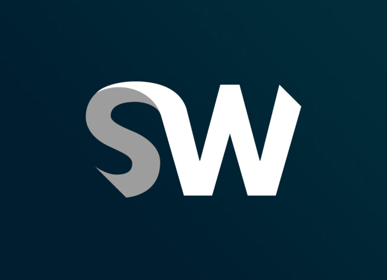
SpartanWare wanted to have a versatile logo design to use in a multitude of circumstances in the form of a text logo, a logo icon, and a shorthand logo.

The Process

After numerous designs, the final design settled for is composed of tones of red, white and blue to represent the British roots of the business, in particular its military heritage.

Project Overview

client: SpartanWare Apparel

services: Brand Design

Date: June 2019

Modern & Unique

It was crucial that the branding would stand apart from anything else, but be modern and slick at the same time.

What SpartanWare Say

  ...totally unique and refreshing...

We are absolutely thrilled with the branding produced. It has encapsulated everything we wanted and gives us a totally unique and refreshing identity to set us apart from our competitors.

Amy Darbyshire
SpartanWare Apparel

Shall we get started?

Pro Skier Branding

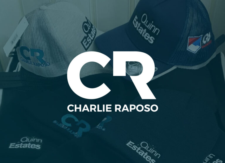
Charlie Raposo Branding
Charlie Raposo

Pro Skier Branding

A clean, sharp, adaptive brand design for GB professional alpine ski racer, Charlie Raposo.

work Outline

Charlie Raposo is one of GB’s top alpine ski racers with a strong drive in both his racing but also his personal identity.

Charlie was seeking to develop a brand for himself which would help elevate his career in alpine ski racing, as well as building himself a platform to promote himself for more than just skiing.

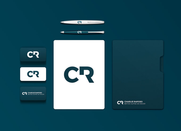
The branding needed to be clean, sharp and above all dynamic, offering a simple but bold approach that would represent him in his skiing, but with the adaptability to be used elsewhere outside of his skiing career.

The Process

We started by taking a look around other top skiers around Charlie, the approach they took and draw off the key areas that appealed to him.

Next we came up with various concepts along with various colour schemes, to be presented refined down to just a couple of Charlie’s favoured options for further development.

Once we had reached the final logo design the brand colour scheme was added and an overall brand style was designed to suit.

Project Overview

client: Charlie Raposo

services: Brand Design

Date: July 2018

Simple, but bold.

The key to this logo design is ‘identity’. It was pivotal that the design be based around Charlie’s initials, ‘CR’.

What Charlie Says

  a brilliant final product

It was an absolute pleasure to work with the team at Acethespace. From when we first started many years ago they have been able to tackle any project with ease. Amazing team with a brilliant final product for any of their clients.

Charlie Raposo

Shall we get started?

Day Trips Branding

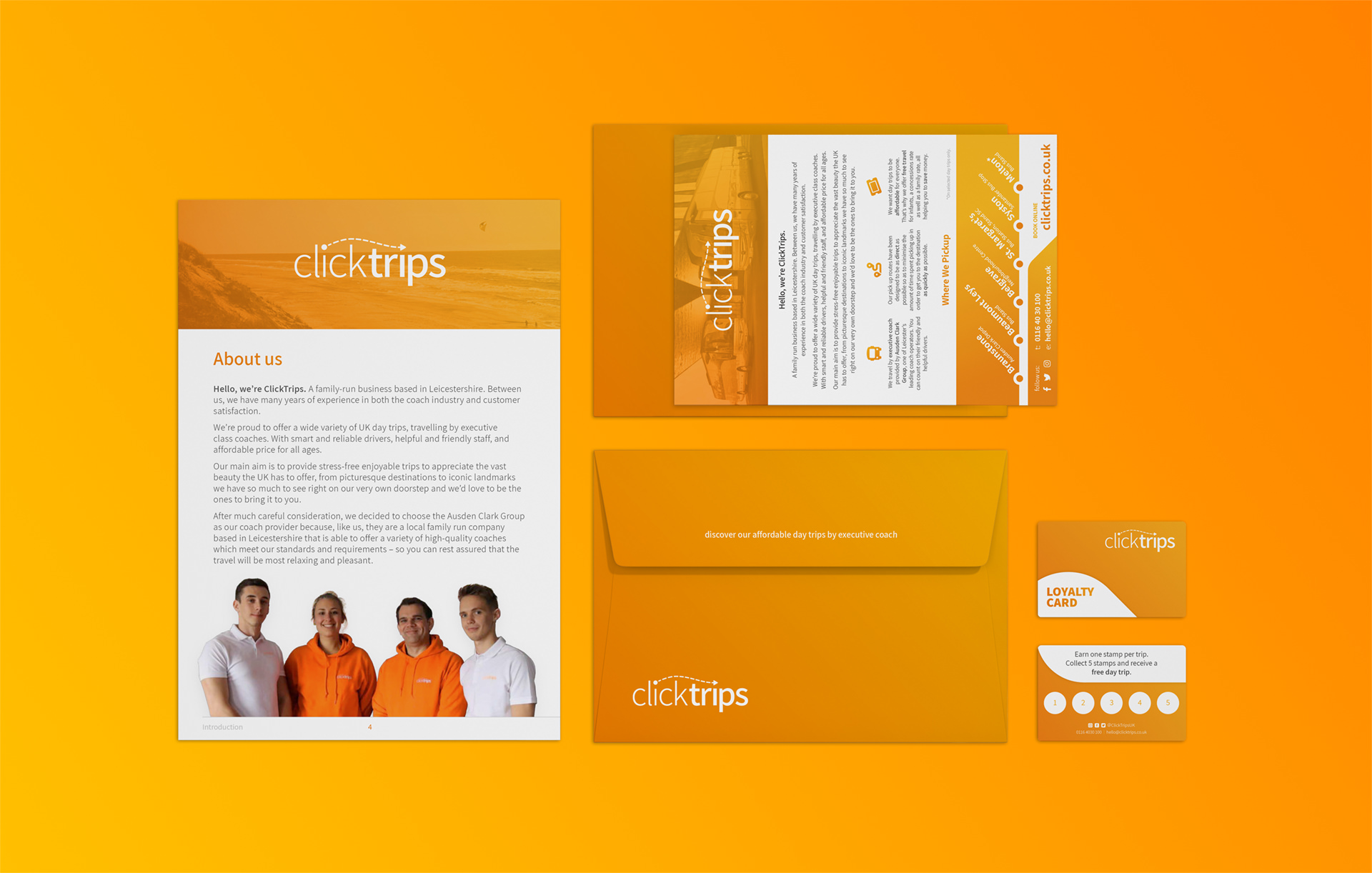
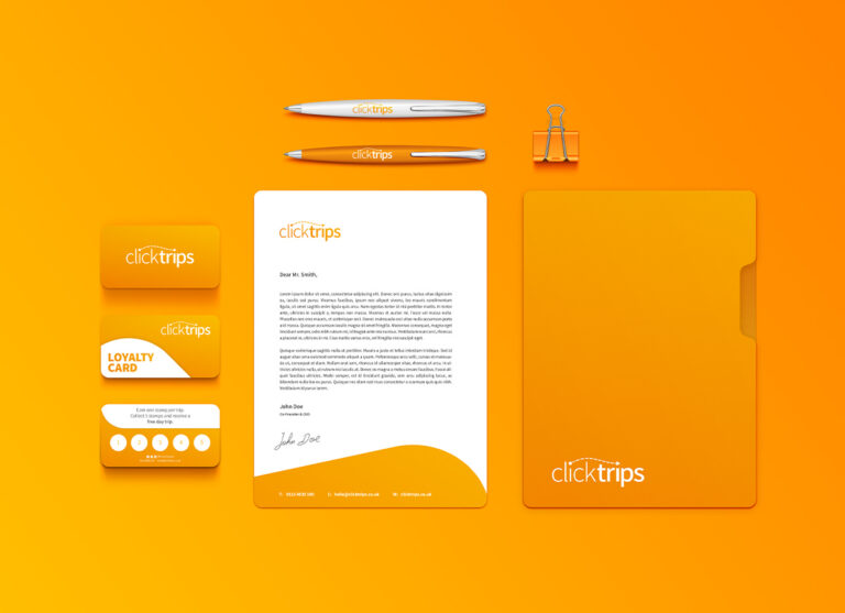
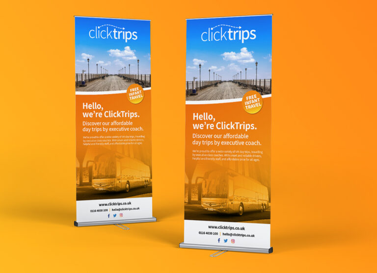
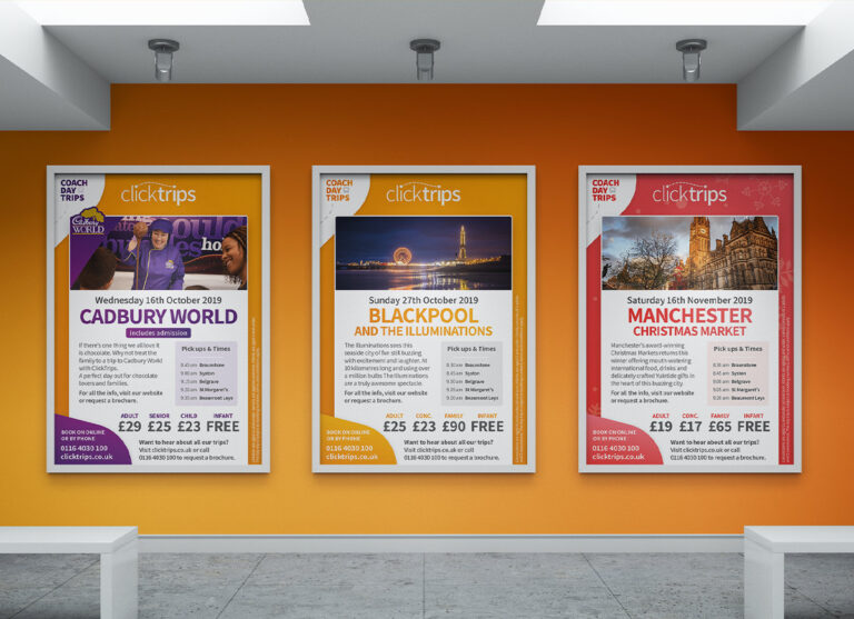
ClickTrips Branding Design
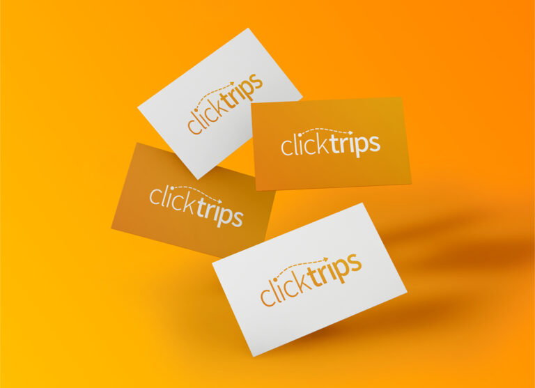
ClickTrips Logo

Day Trip Branding

A warm and inviting brand design for startup coach day trip business, ClickTrips.

work Outline

As a new startup, ClickTrips were looking to establish a branding. The business itself would be very customer-centric, focussing on delivering a reliable, friendly and personal service to its customers.

It was key that the overall design was warm and inviting, whilst portraying the transport and travel element of the business venture.

The Process

After meeting to discuss the project further to identify keys areas we wanted the branding to focus itself around, we kicked things off with draft designs for the brand logo.

Firstly designing various concepts without colour, these concepts were presented and whittled down to just a few for further development.

Once we had reached the final logo design the brand colour scheme and styling followed, again offering a plethora of option, the warm glow of a sunset gradient stood out.

Project Overview

client: ClickTrips

services: Brand Design

Date: 1 March 2019

Designed to invite

The overall branding has been specifically tailored to give a warm and inviting feel with its use of gradient colours twinned with a clean white and smooth curving edges.

What ClickTrips Say

  Everyone loves the warm glow of colours.

The brand design is an absolute triumph. We’re constantly being told how much people love our colours, our logo, and the design of all of our branded material. It is more than just a step ahead of our competitors.

The ClickTrips Team

Shall we get started?